The PATH Wayfinder App - Case Study
Background
The PATH, known as the world's largest underground mall in Toronto, is often likened to a complex underground labyrinth. Personally, I've struggled with directions for as long as I can recall, often finding myself lost within the PATH. Its signage and maps, in my experience, lack clarity and fail to offer sufficient guidance. Hence, I've decided to do a case study focused on reimagining a mobile app to address these challenges within the PATH.
User Interviews
I conducted 4 user interviews, all with individuals employed in the downtown core. I used an affinity diagram to visually map out their pain points, behaviors, and motivations. Similar responses were highlighted with a circle, helping me identify recurring themes and sentiments among the interviews.
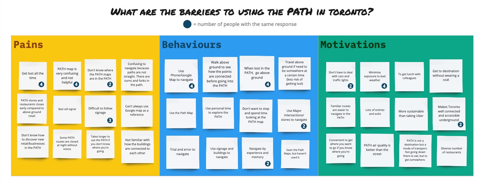
Pain Points
Inadequate Signage and Maps
Users frequently encounter challenges with the signage and maps within the PATH. They might find them insufficient, unclear, or lacking in detail, making navigation more challenging. At times, users don't even know where to find the maps in the PATH.
Lack of Distinct Landmarks
The lack of distinctive landmarks or notable features along the routes can lead to disorientation. To save time, some users even go above ground to continue their route as they can navigate better by referencing major intersections and stores.
Navigational Information Updates
Outdated or inaccurate information on maps, directions, or closures within the PATH can confuse users and lead to inefficient navigation. It would be useful to have information of the PATH be crowdsourced via the app so that the info stays up to date as much as possible.
Connectivity Issues
Some areas within the PATH have limited mobile network coverage or Wi-Fi access, restricting the use of digital maps or navigation apps. The PATH Wayfinder app will need to give the option for users to download the map ahead of time so that offline navigation can happen.
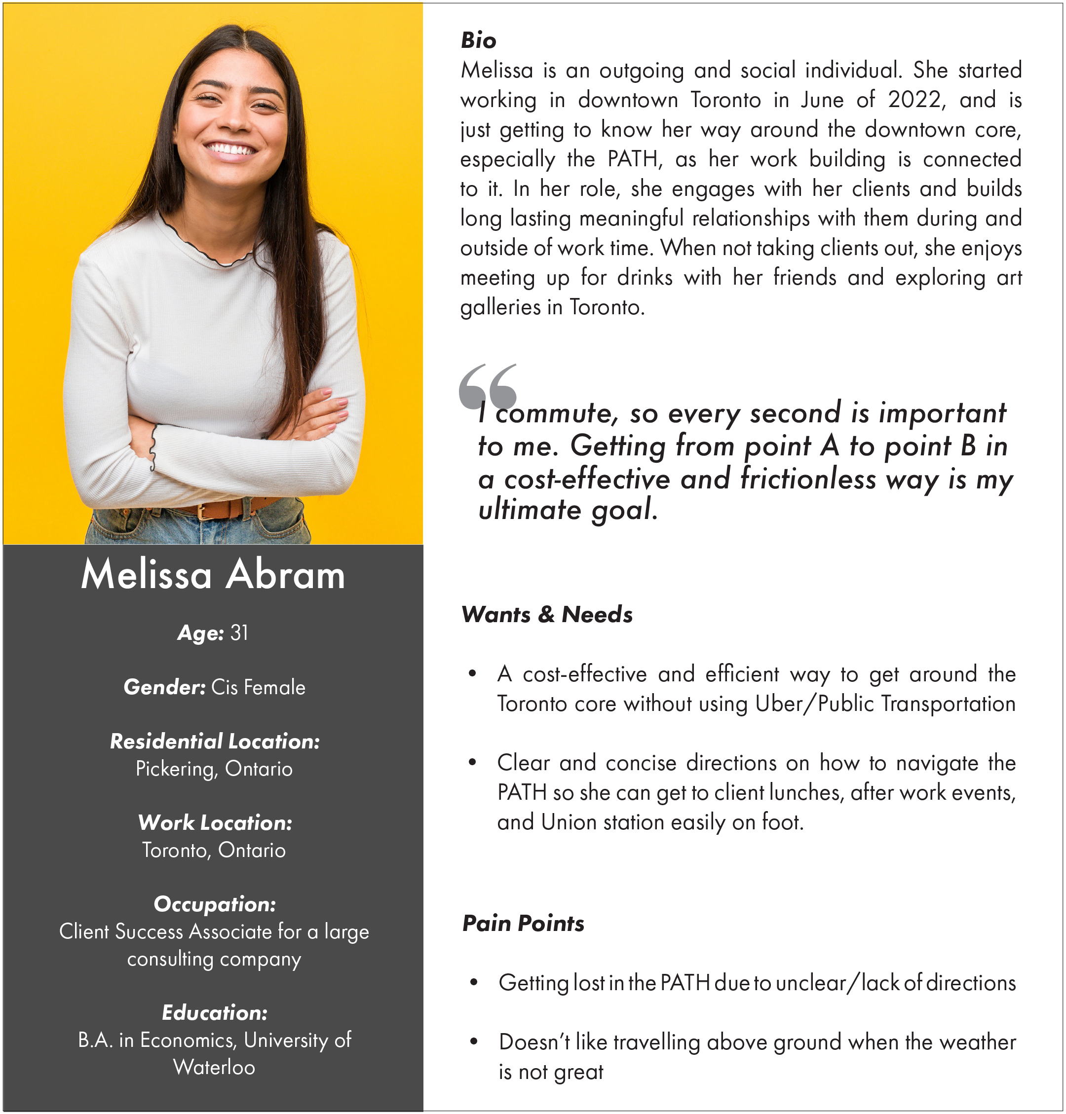
User Persona
After analyzing the responses in the Affinity Diagram, I noticed common themes and created a fictional persona by blending together shared characteristics from the user interviews.
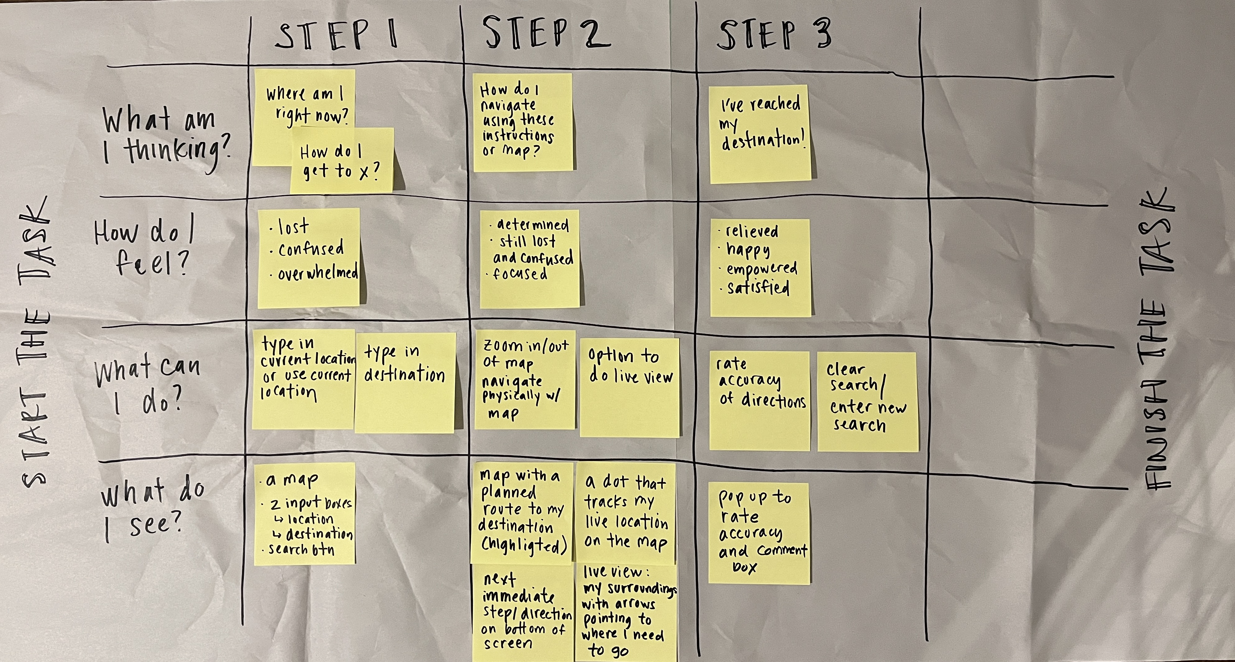
User Experience Map
Considering the persona's perspective, I focused on the critical user flow—navigating the PATH by searching for destinations and following app directions. To gain insights into their thoughts, emotions, actions, and surroundings during this essential task, I developed a user experience map.
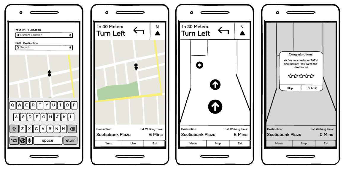
Sketch / Low Fidelity Wireframe
Based on the insights from the "What do I see" section of the Experience Map, I've sketched a few low-fidelity wireframes outlining each step involved when users search for destinations and navigate using the app's directions.
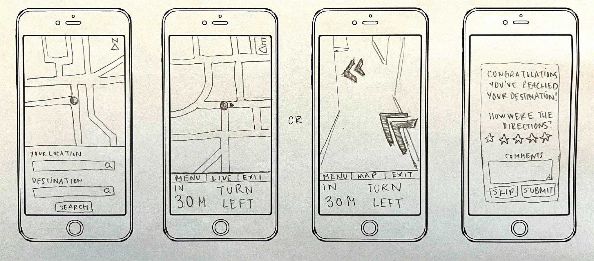
After testing with low fidelity wireframes, I was able to refine the following elements of the app based on user feedback:
- Move the main directions to the top (instead of having it at the bottom) as people are used to looking at direction cues at the top (i.e., Google Maps)
- Clearly show the cardinal directions (North, East, etc.) next to the directions as cardinal directions are crucial when travelling underground (it gives some sense of spacial reference to what's above ground)
- Have the option of choosing estimated walking time or amount of steps
- Put the buttons/nav bar at the very bottom of the mobile app to limit distractions
Revised Wireframe
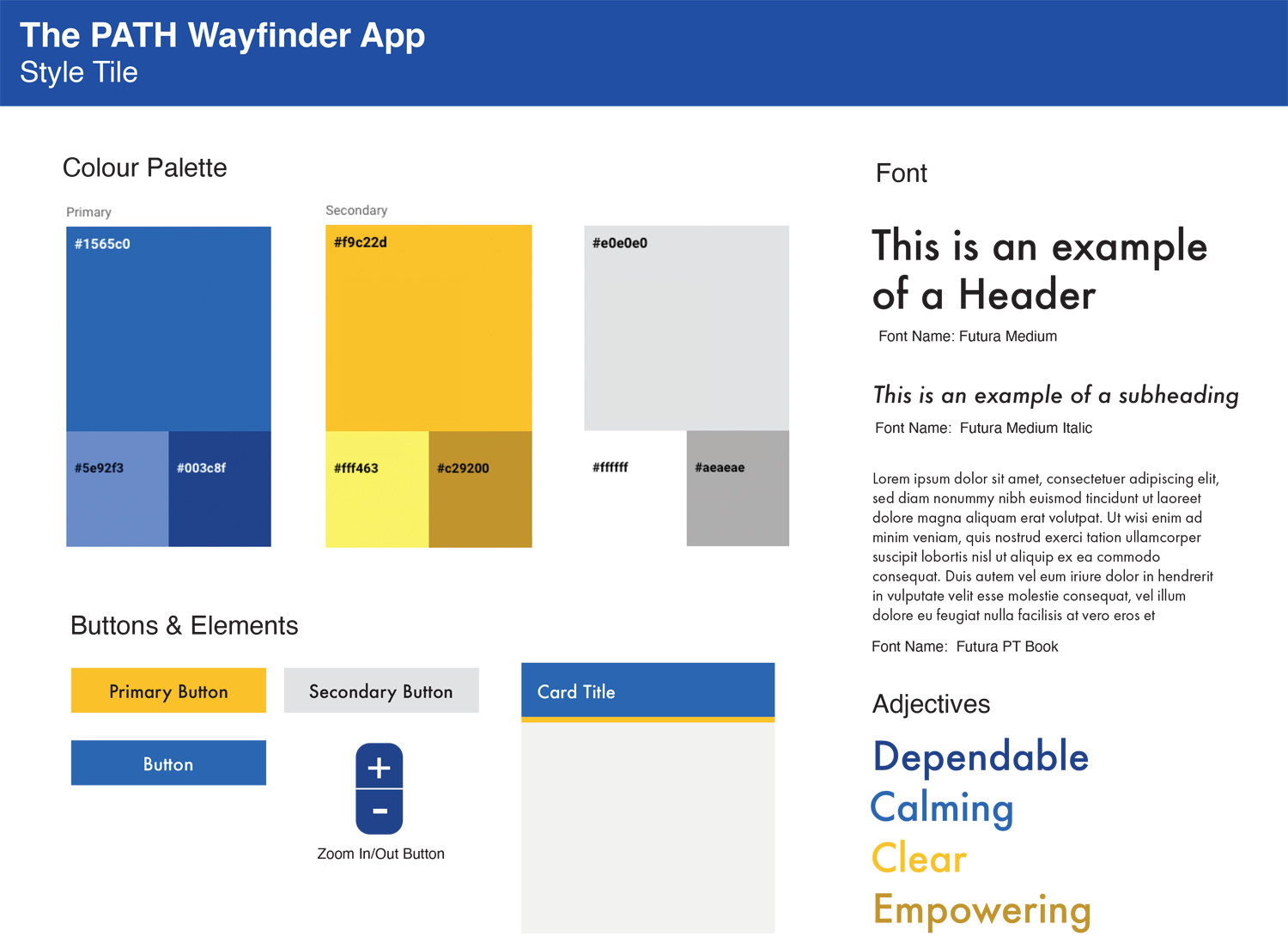
Style Tile
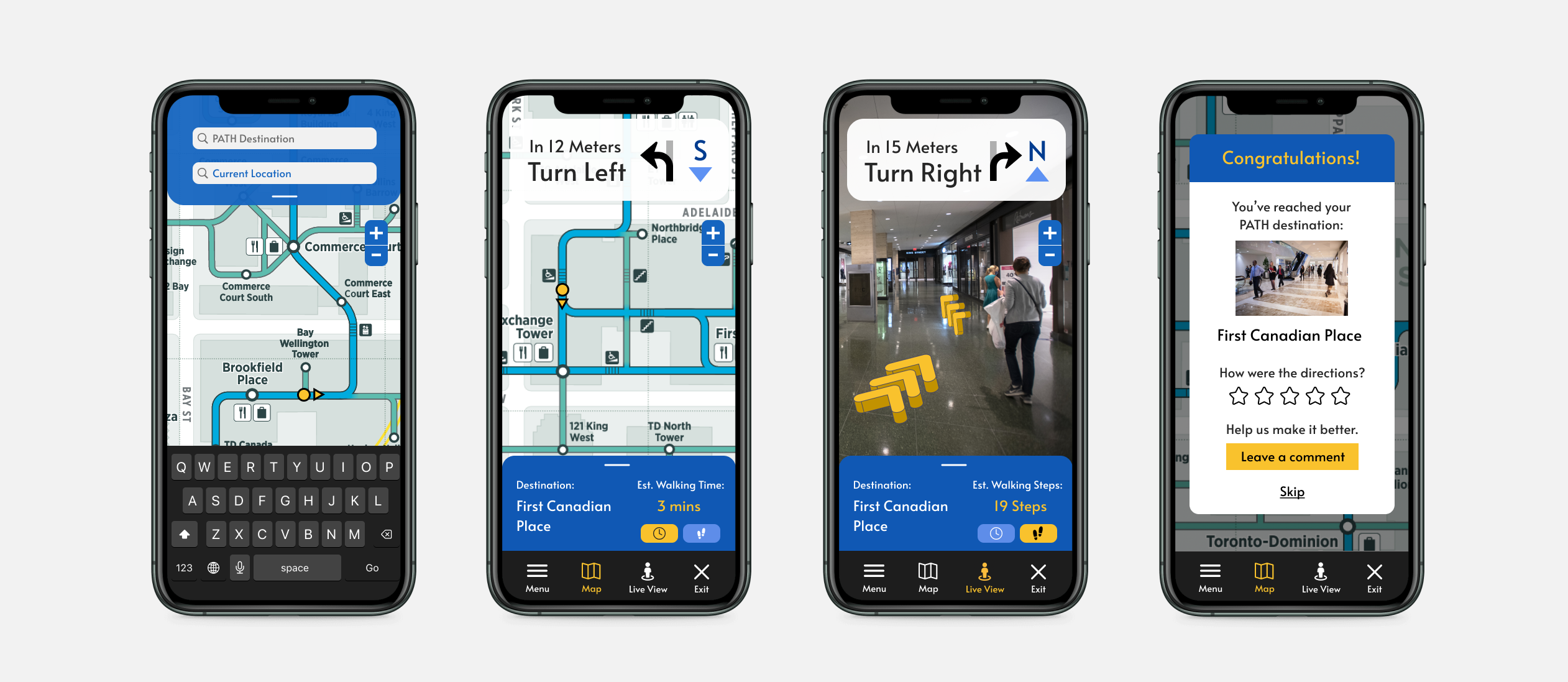
Final Design
Conclusion
This case study reinforced the significance of conducting initial user interviews, even with a small participant pool. Identifying recurring themes from these interviews highlighted key pain points and guided prioritization. Early user testing with basic wireframes/prototypes yielded valuable insights, enhancing the app's design and efficiency.
Next Steps
I plan to conduct additional interviews with a more diverse group, focusing on non-Toronto residents, to enhance the app for tourists. Improving the map and signage system based on feedback about the confusing PATH maps is a priority. I aim to learn from other cities like Hong Kong, whose underground systems have user-friendly maps, and adapt similar features for the PATH map.