360 Feedback App
In a nutshell
This enterprise web application lets users invite colleagues and managers to complete a 360 assessment on them, and view aggregated results via a user-friendly dashboard.
My Role
I wore many hats on this project. I contributed to the UX/UI Design, Front-End Development, Database Architecture, and Project Management to help define scope. I collaborated with another Full-Stack developer to bring the product to life.
Background & Problem
- Missing the product - This organization has been without an active solution for a 360 assessment since 2018, which leaves them with a gaping hole in their development and career practices.
- Expensive and limited ability to scale - Getting external vendors to administer 360 assessments were also very expensive and hence, only select few executives per year were able to actually have a 360 assessment, let alone non-executive employees.
- Costly to administer and resource drain - 360 assessments usually take alot of resource hours to administer manually, and takes a considerable amount of time for respondents to complete the assessments because it is mostly text based (comments).
The solution had to do more than just gather and compile 360 assessment data. It required automation, scalability (to accommodate more employees initiating a 360), user-friendliness, and efficiency without draining resources. Working closely with the Line of Business (LoB), I assisted them in every phase—from exploration and design to testing and technical development. Presently, the app is undergoing a trial with a few hundred employees. It is scheduled for an Enterprise-wide launch in April 2024, aiming to reach approximately 70,000 employees.
What are 360s?
A 360 Feedback involves collecting feedback from multiple sources — self, manager, direct reports (if applicable), peers, and other stakeholders to provide employees with a well-rounded (360 degree) view of how they're perceived at work.
User Personas
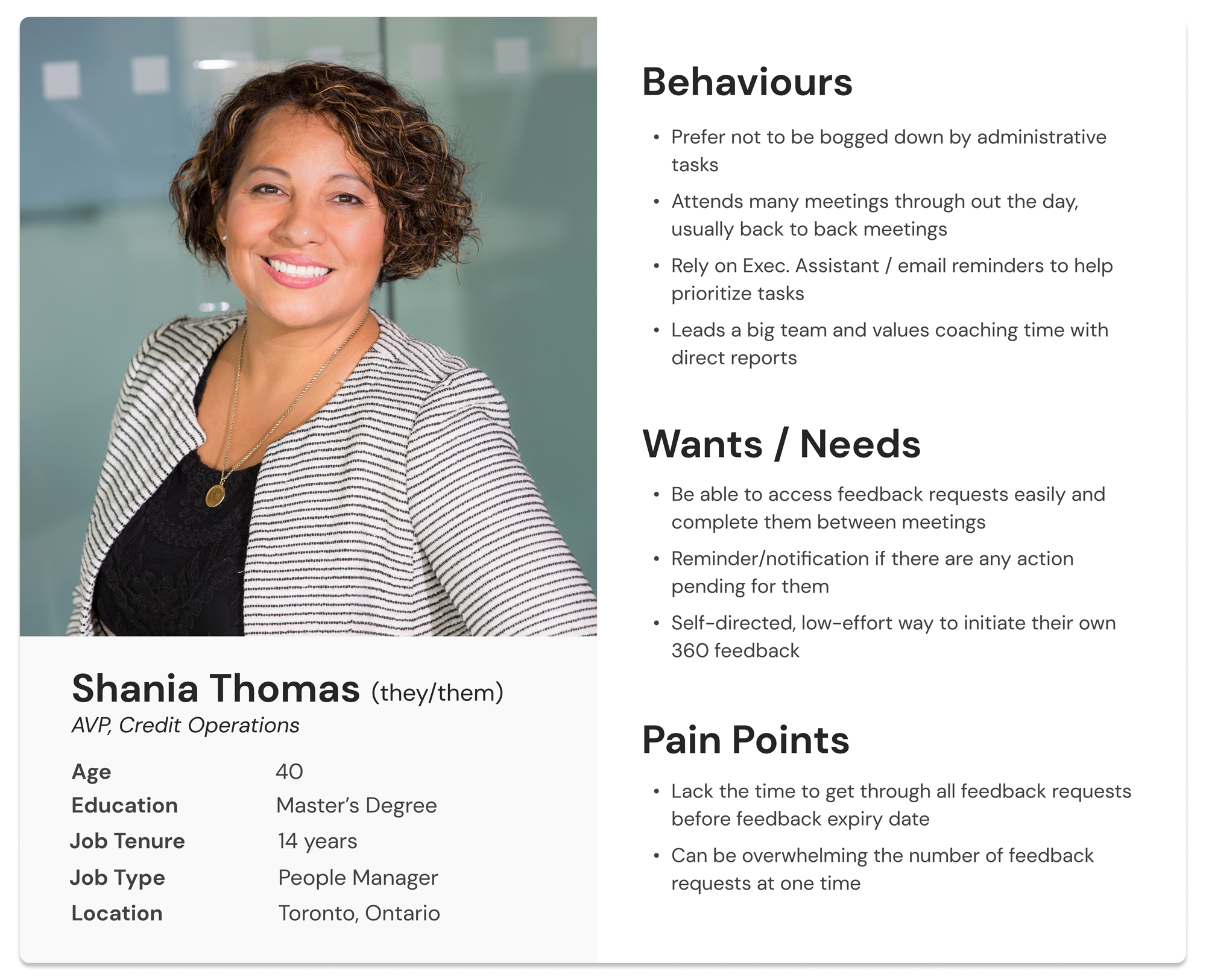
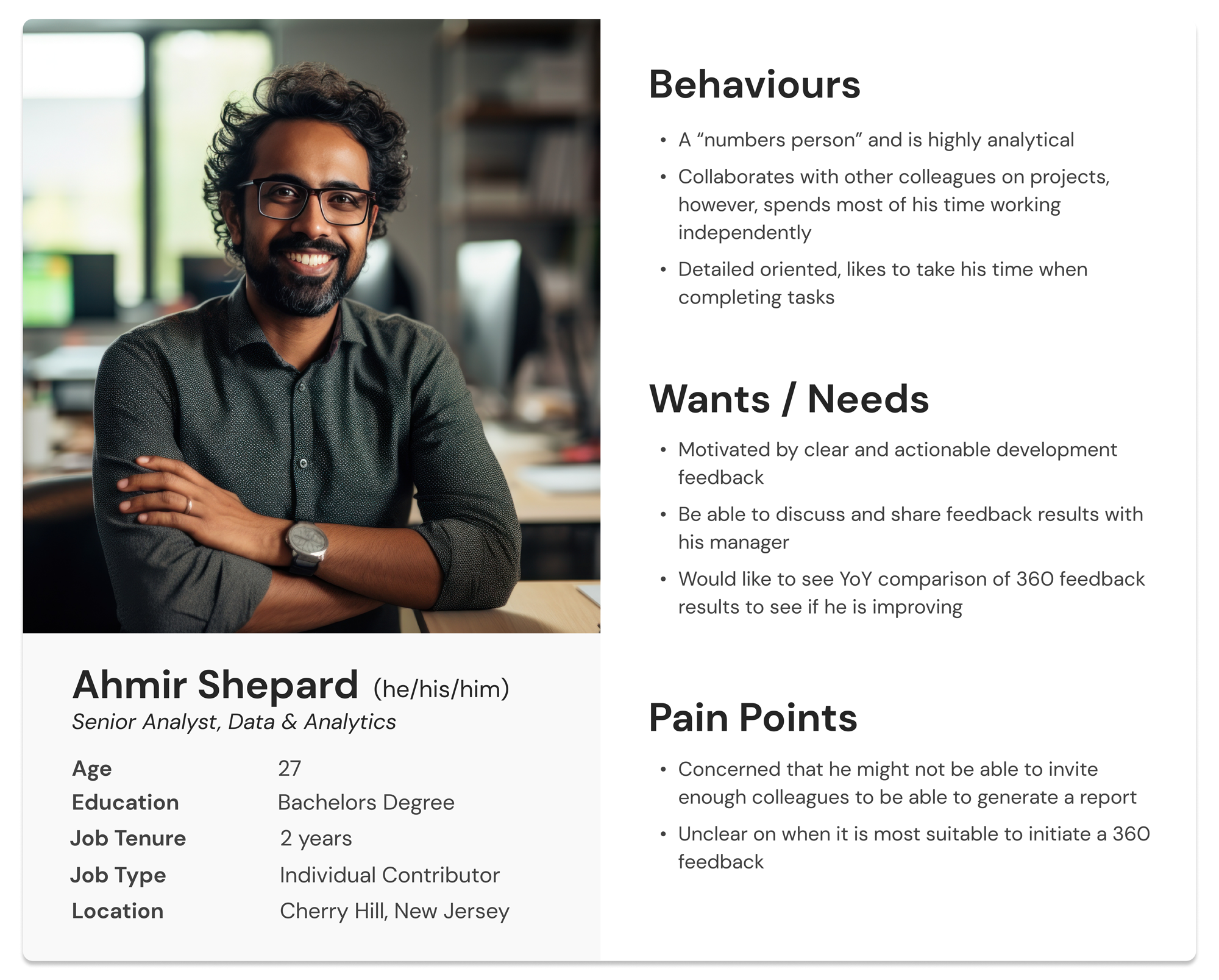
I collaborated with experienced members from the LoB team, who possessed extensive expertise in 360 feedback from their current or previous roles in different organizations. Through numerous sessions and discussions about their past experiences with 360 feedbacks, I developed personas that effectively represented our primary user categories: Managers and Individual Contributors.
User Stories
Next, I was able to facilitate a requirements discovery session with the team where I worked with the LoB team to create users stories that would flow from both of the personas. The user stories help translate into more refined technical requirements later on.
| Epic | As a Manager, I need to be able to approve my direct report's 360 requests. |
|---|---|
| User Stories | As a Manager, I want to see the details of a 360 request (requestor name, rater name, comments from the requestor. etc.) |
| As a Manager, I want to be able to approve and decline request individually. | |
| As a Manager, I want to include a reason why I've approved/declined a request. |
Workflow/Taskflow
After understanding the requirements, we discussed fitting them into an automated workflow from start to finish. This was a crucial step early on to grasp how data moves through the application as it has an impact on database design and the user experience. Discovering dependencies in the steps helped prevent major code rework later. The workflow chart also simplified discussions about different user scenarios.
Site Map
In an effort to familiarize users with the system, I crafted a site map mirroring the actual workflow, featuring major workflow steps as primary navigational elements on the website. The menu items change based on the user's role. For example, Individual Contributors won't see 'Approve' since they don't have approval tasks. This helps keep the page clean and shows only what's relevant to each user.
Low Fidelity Wireframes
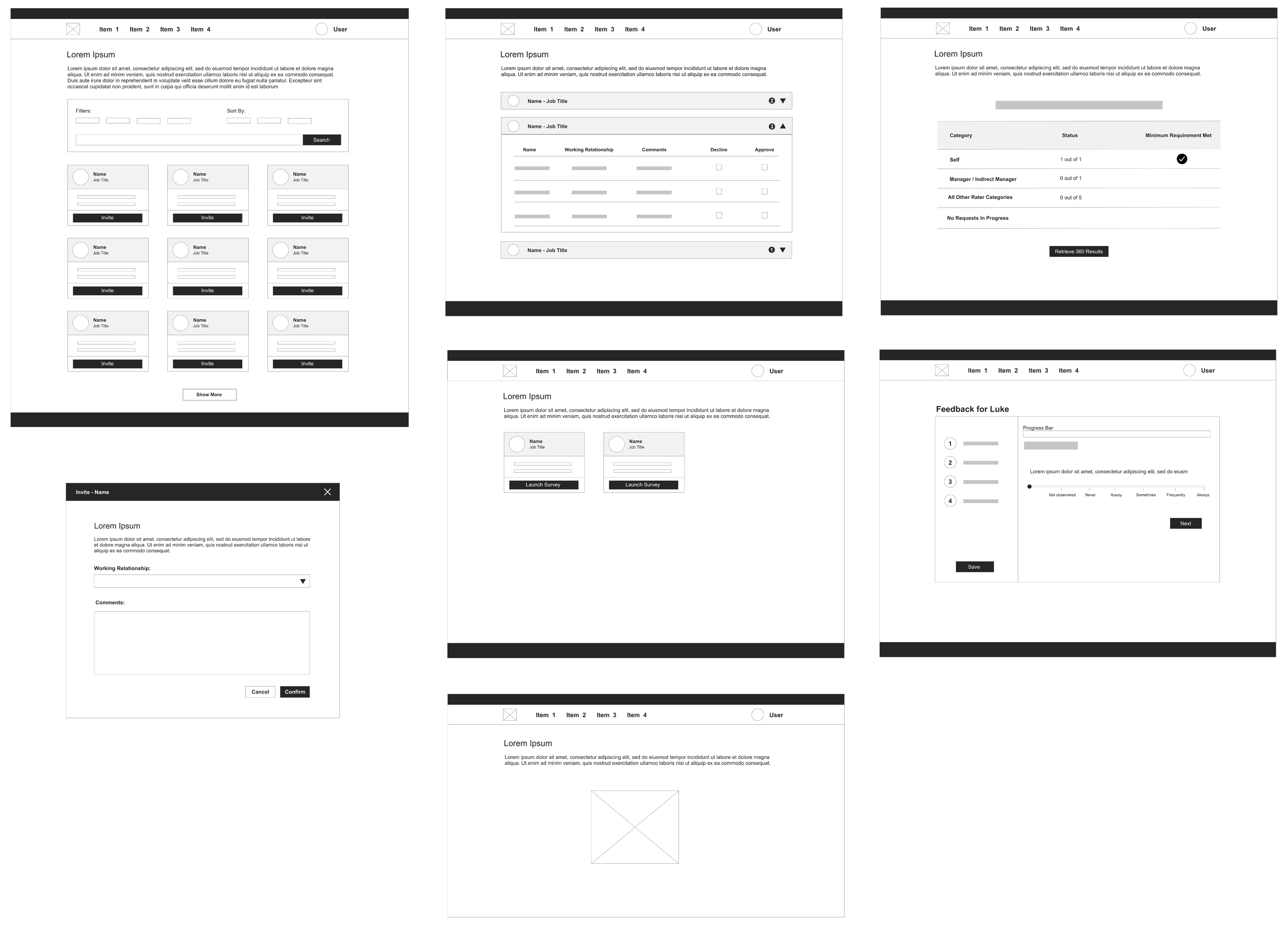
Next, low fidelity wireframes were built based on the workflow and site map that were established previously. This enabled me to do internal testing with the LoB team members and get their early feedback.
Usability Testing
I conducted external user testing with 5 testers who weren't part of the project team to evaluate early prototypes of the 360 assessment form. My goal was to ensure that the form was user-friendly. Testers used a working prototype and shared their thoughts aloud while completing the assessment. Based on their feedback, I found that Option #1, with a layout following a left-to-right reading pattern, was the most preferred. Option #2 overwhelmed users by presenting multiple questions simultaneously, and Option #3, requiring a top-to-bottom reading approach, added more cognitive load for users compared to the left-to-right layout.
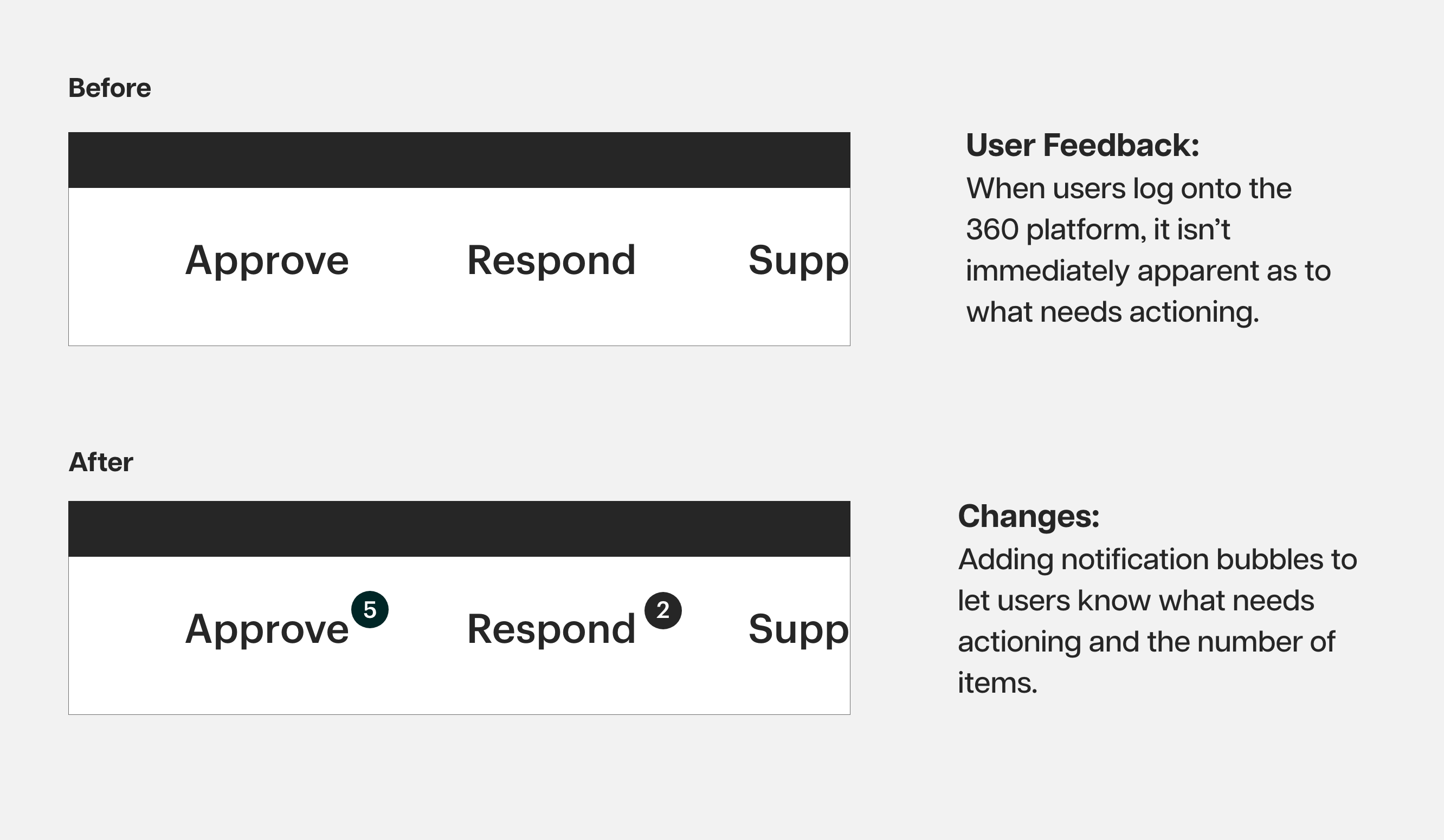
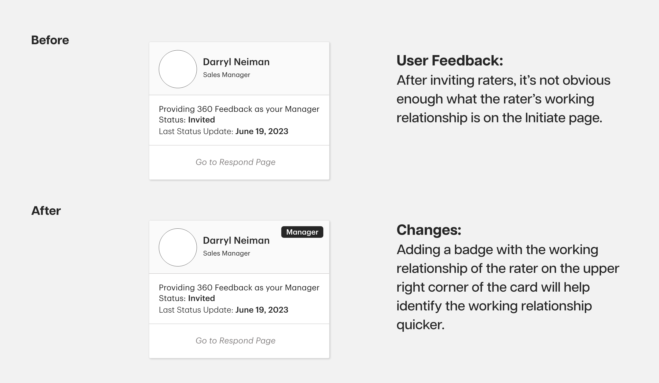
After completing the initial development phase of the 360 application, the LoB commenced their comprehensive end-to-end testing with approximately 15 users over a two-week period. Throughout this testing period, I regularly received feedback and change requests daily. My colleague and I followed an agile approach, swiftly implementing technical modifications and redeploying the updates to the testing environment for continued assessment by the LoB. I received over 60 change requests in total. While some requests were related to information architecture and copywriting, there were specific feedback items that enhanced the overall user experience like the ones below.
Final Design
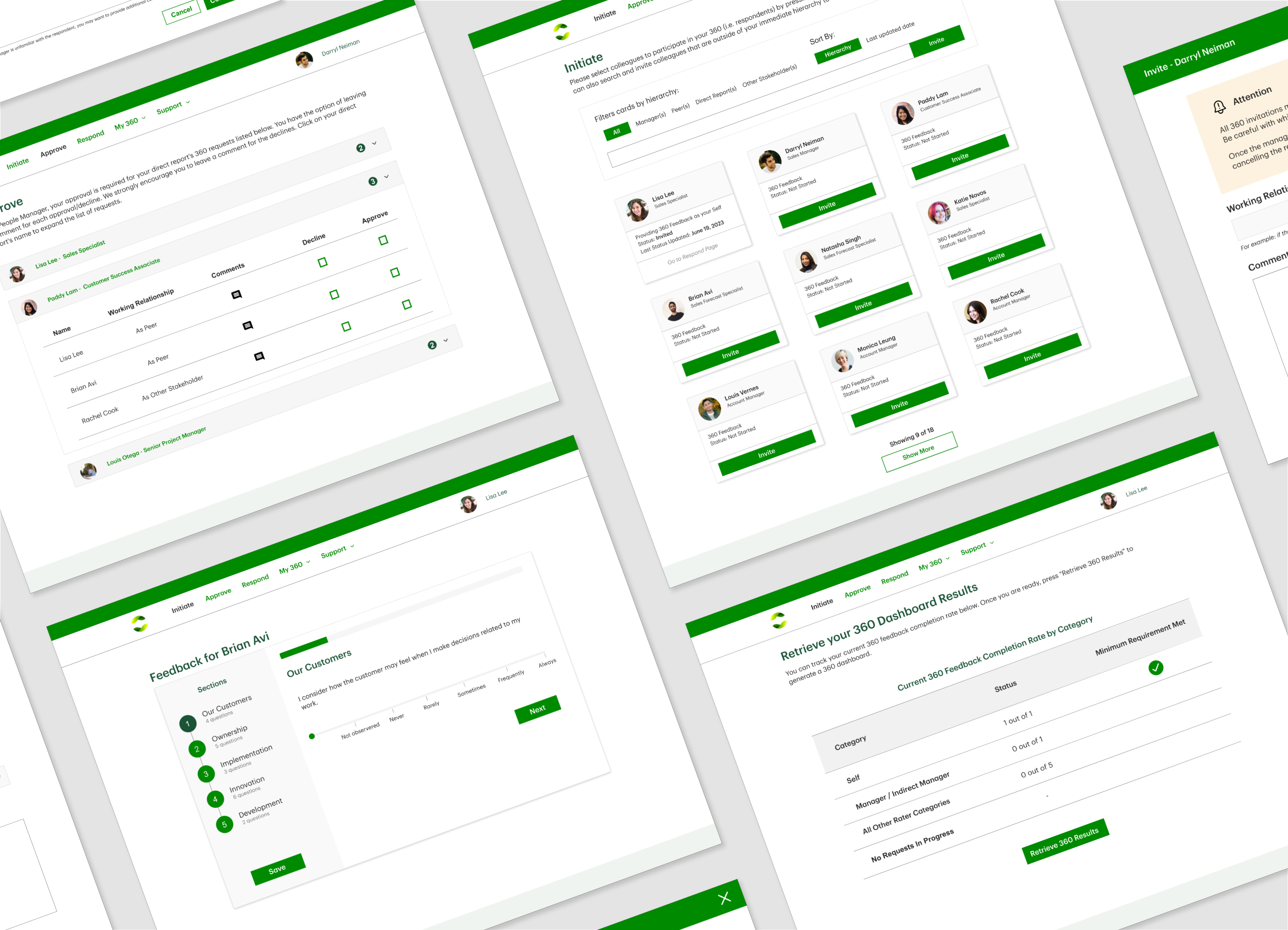
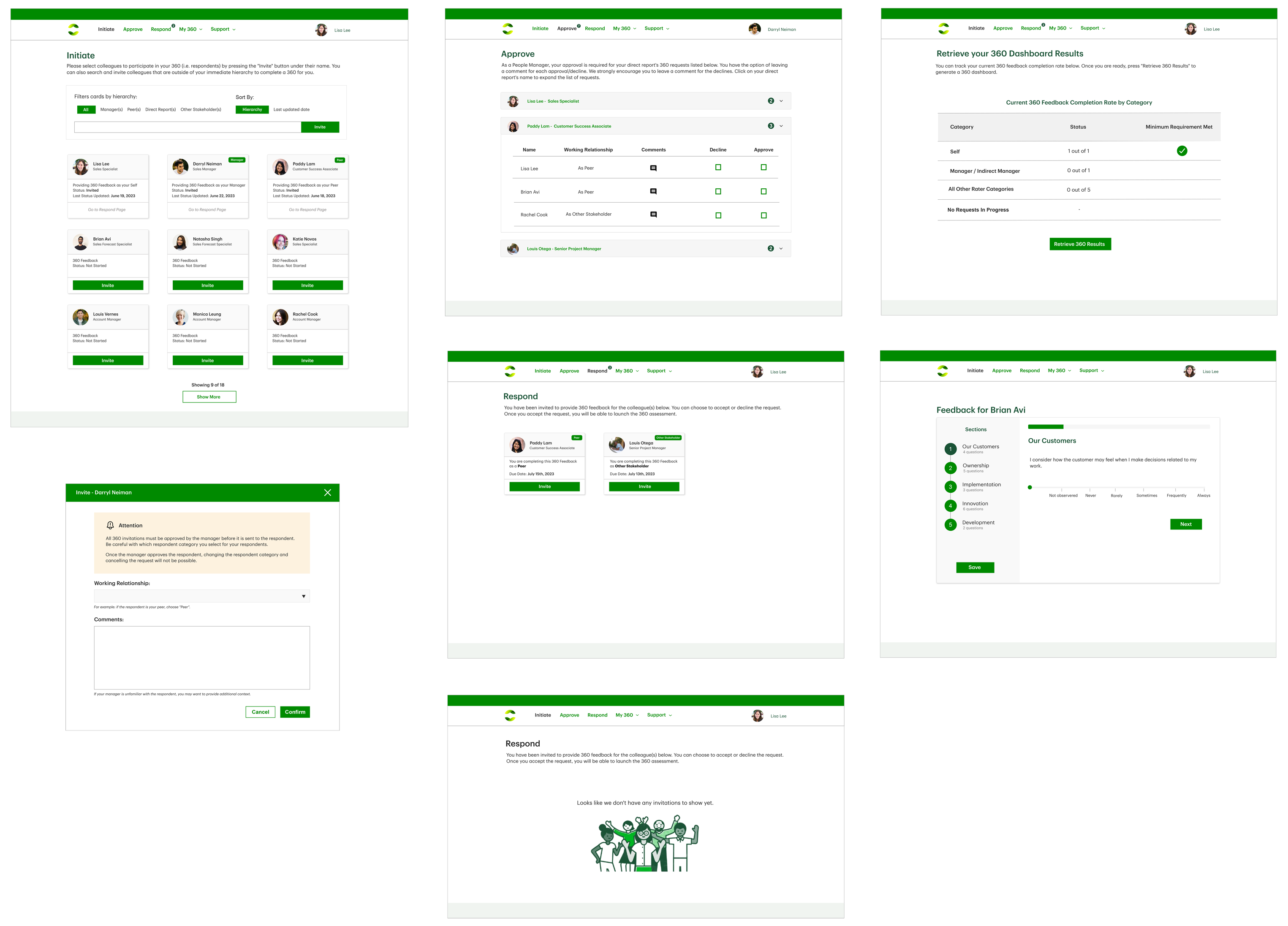
This organization already had a design system in place, so the design and colour scheme was based largely on the design system for a more seamless enterprise feel.
Impact
Building this solution in-house provided significant savings in both development and maintenance cost for the LoB. Moreover, its in-house construction allowed us to tailor it precisely to meet business requirements and begin gathering data for future analytics. Since the launch of this 360 assessment app, it has replaced one of the external vendor assessments which usually costs $4,500 to administer per person, bringing the cost down to essentially $0. Additionally, the app operates as a self-service platform, eliminating the need for administrative hours to initiate a 360 assessment for a requestor. Lastly, because it is largely numerical based (rate someone on a scale as opposed to providing comments), it has cut down the time to complete a 360 assessment by 50%. To date, this app has helped save the organization $415,000 in value, and continues to do so as more employees utilize it.
Conclusion
Throughout this project, I've discovered the immense value of user testing in refining designs and technical development for continuous improvement. Due to the project's tight timeline, I missed the opportunity to conduct a thorough competitive analysis of other 360 assessment products. Understanding what features work well for competitors and identifying potential pitfalls could have provided valuable guidance for future improvements. Moving forward, I believe proposing a competitive audit to the LoB is a crucial step. This audit will help us gauge the positioning of the 360 app, identify strengths, and recognize any gaps. This project is still ongoing with regular update releases, so stay tuned on the evolution of this 360 Feedback application!
